

Is It Time To Redesign Your Website? 9 Clear Signs
A website doesn’t fail overnight. It becomes less usable, less aligned, and less effective quietly. Because there’s no dramatic crash, most companies wait too long to redesign.
If you are questioning whether your site is still doing its job, you are already asking the right question. The harder part is answering it with certainty.
This article gives you that certainty. Based on patterns seen across hundreds of redesigns, it outlines 9 signs experienced UX strategists, developers, and marketers watch for: signals buried in analytics, backend friction, and user behavior. If these show up, it’s time to rethink how your website supports growth.
Let’s get right to it.
Redesign Or Just Refresh: Here’s How To Make The Right Call
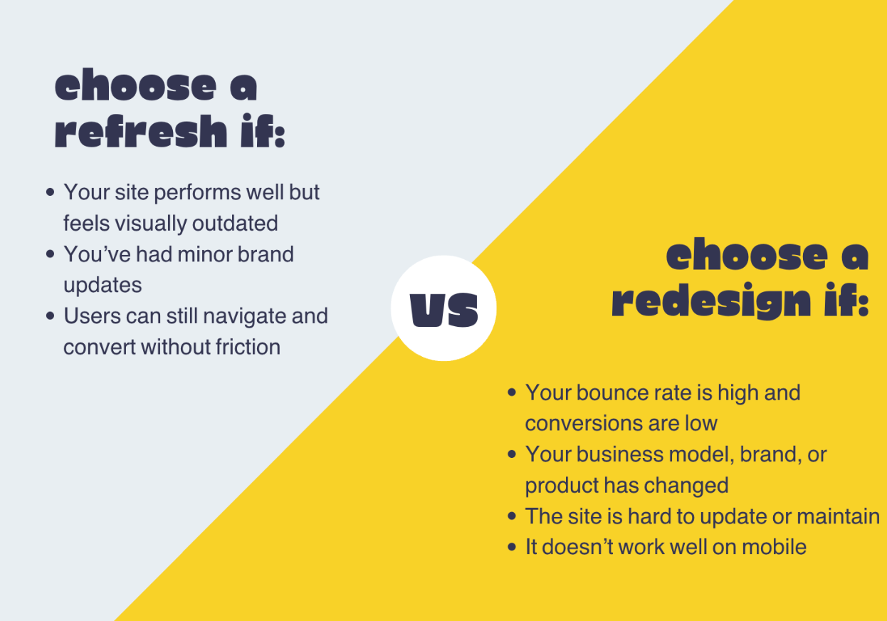
Not every website problem calls for a full teardown. Sometimes, targeted adjustments are enough. Here’s how you know what you need:
A
website refresh updates visual elements: fonts, colors, images, headlines, without changing how the site is structured or how users interact with it. It’s for when your site works fine but looks outdated or slightly off-brand.
A
website redesign, on the other hand, changes how your site works. It restructures pages, updates the backend, improves navigation, and rethinks the user journey. It’s for when your site isn’t converting, isn’t mobile-friendly, or no longer supports how you sell.
9 Expert-Backed Signs It’s Time To Redesign Your Website (With Metrics That Matter)
As you go through each sign, pay close attention to the action points and the benchmarks.
Sign 1: You’re Explaining Workarounds To New Visitors
If your team has to constantly explain how to find things on the site, your UX is broken.
When users need help to complete basic tasks like finding pricing, booking, or submitting a form, it’s not a user error, it’s a design failure. Clear navigation and intuitive flow should make the experience self-explanatory.
If your team finds themselves sending links, writing “how to” emails, or walking visitors through the site, you're compensating for a poor user experience.
What To Look Out For:
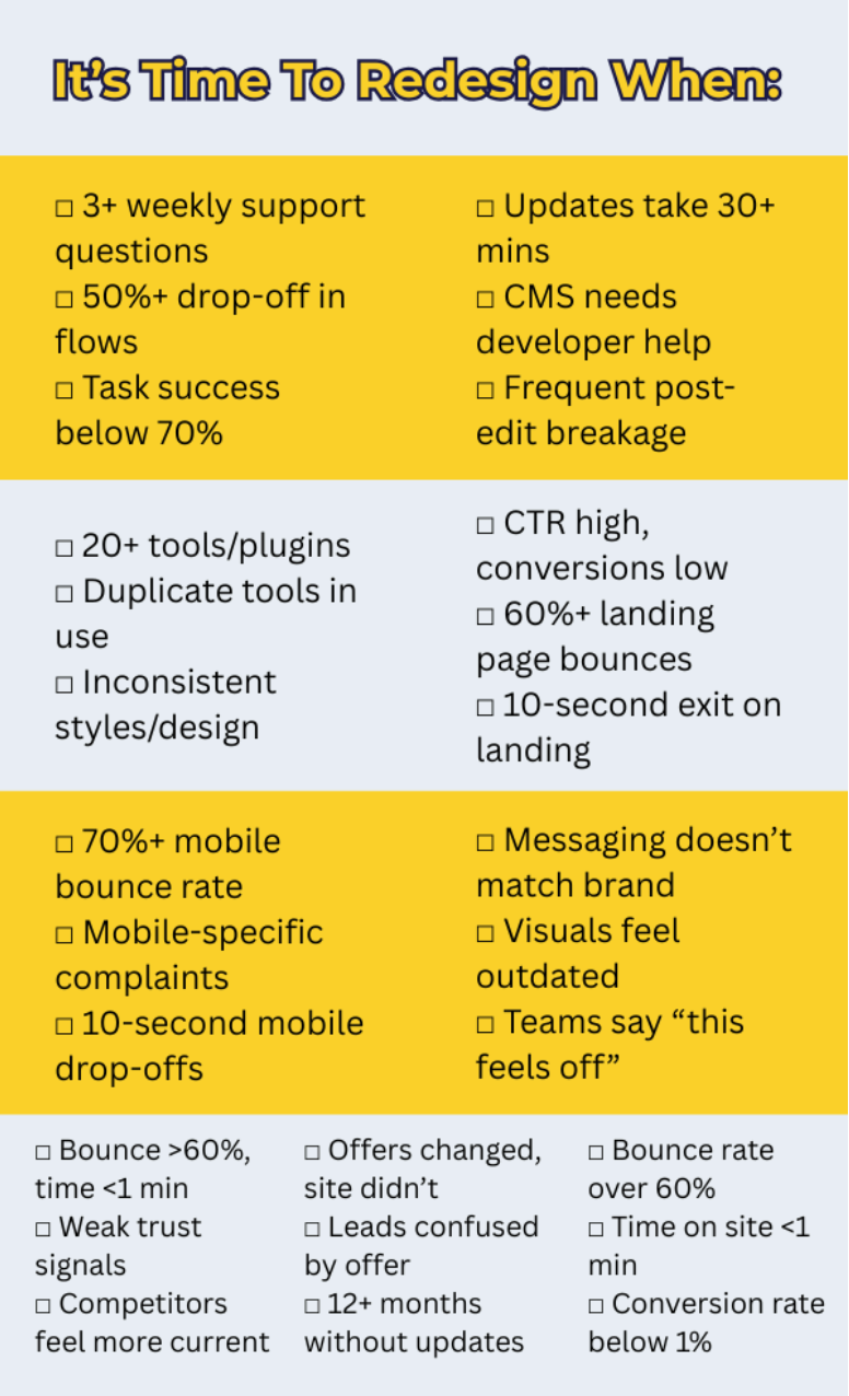
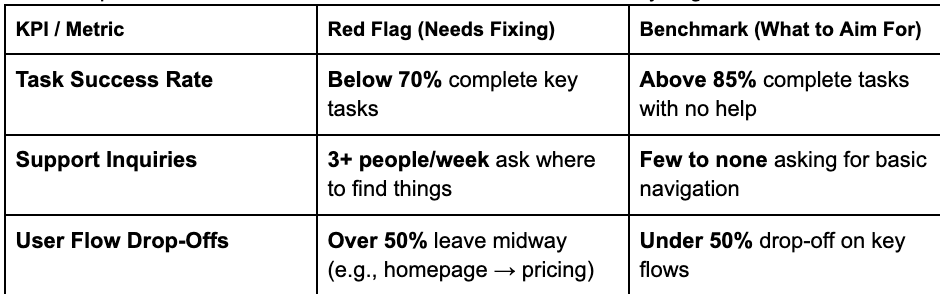
- 3+ support inquiries/week asking where to find pricing, contact forms, or key product info
- 50%+ drop-off rate on critical user flows like “View product → Add to cart” or “Homepage → Pricing page” (check funnels in Google Analytics or GA4)
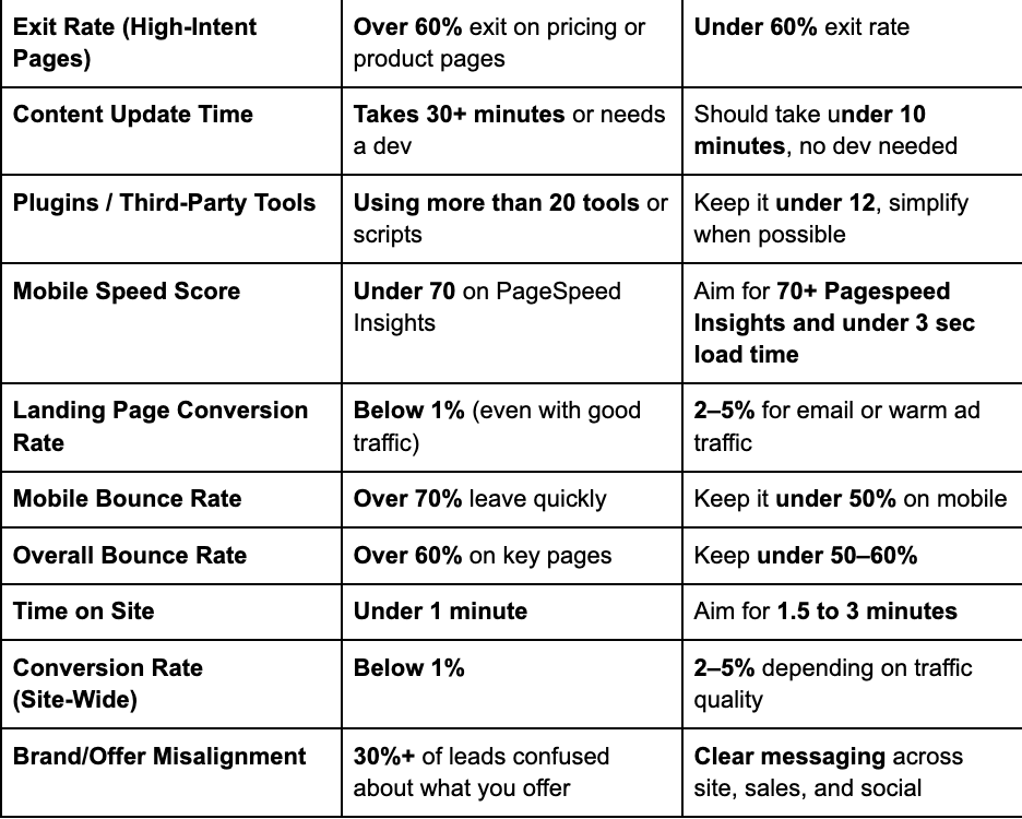
- Exit rate over 60% on pages like pricing, booking, or product detail, especially when they’re not the final step
Benchmark To Aim For:
Your task success rate is the percent of users who complete key tasks without assistance should be above 85%. Below 70% is a clear indicator your UX needs rework.
What You Need To Do:
- Run a usability test with 5–7 users. Give them simple tasks (e.g., “Find the pricing page”) and watch where they struggle.
- Review heatmaps & session recordings. Look for backtracking, rage clicks, or long cursor hovers on menus and buttons. Work with a web design expert to interpret the results.
- Simplify your site’s main navigation and homepage flow. Prioritize your primary CTA (e.g., “Book a demo,” “See pricing”) and remove low-impact distractions.
Sign 2: Your Team Dreads Updating Anything
If making a simple change like updating copy, publishing a blog post, or adding a team member requires a developer, your website isn’t scalable. A content bottleneck slows down marketing, delays product launches, and keeps your site outdated.
Your website should support your team, not depend on a technical gatekeeper. If internal updates feel risky, time-consuming, or stressful, it’s a sign the backend wasn’t built with flexibility in mind.
What To Look Out For:
- Content updates take 30+ minutes even for simple changes like text or image swaps
- Only developers or tech leads feel comfortable making edits, marketers avoid the CMS entirely
- Site breaks or formatting issues happen frequently after small updates
Benchmark To Aim For:
Your team should be able to update content text, images, blog posts, CTAs in under 10 minutes, without developer help. If updates regularly require technical support or introduce bugs, your CMS is working against you.
What You Need To Do:
- Audit your current CMS and editing process. Track how long updates take and who’s involved. Look for patterns of friction or delay.
- Interview your marketing or content team. Ask what they avoid updating and why. If there’s hesitation, it’s likely because of poor backend usability.
- Switch to a no-code or low-code CMS. Platforms like Webflow, Storyblok, or modern WordPress block editors empower non-technical teams to update content confidently without breaking anything.
Sign 3: You’ve Hacked On So Many Features, It’s Become A Frankenstein
Over time, it’s easy to bolt on new tools, pop-ups, and plugins to solve short-term problems. But those quick fixes add up, slowing down your site, bloating your code, and making the user experience feel disjointed.
If your site feels clunky, loads slowly, or breaks when you add one more feature, you’re not iterating, you’re patching. At a certain point, the only fix is to step back and rebuild with performance and consistency in mind.
What To Look Out For:
- 20+ third-party plugins or scripts running at once (forms, pop-ups, chat, analytics, etc.)
- Multiple tools doing the same job (e.g., two booking tools, overlapping form builders)
- Inconsistent fonts, layouts, or button styles across pages, often caused by plugin conflicts or manual overrides
Benchmark To Aim For:
Your
mobile page speed score should be above 70 on Google PageSpeed Insights, and you should keep
third-party plugins under 12 wherever possible.
What You Need To Do:
- Audit every plugin, script, and third-party tool. Remove anything redundant, outdated, or rarely used.
- Run a full performance test using GTmetrix or Google PageSpeed Insights. Focus on mobile speed.
- Rebuild with fewer tools that do more. Choose all-in-one platforms when possible, and define a clear visual system (typography, spacing, colors) to keep your design consistent as you scale.
Sign 4: Your Site’s Metrics Flatline After Every Campaign
High click-through rates but low conversions are a clear sign something’s breaking between the ad and the action. If your campaigns are doing their job, driving traffic but the landing experience fails to convert, it’s not a marketing issue. It’s a design, UX, or messaging problem.
Campaigns should create momentum. If your landing pages are undercutting that momentum with friction, confusion, or generic content, you are burning traffic and budget.
What To Look Out For:
- Email or ad click-through rates between 15–30%, but conversion rates below 1%
- High bounce rates (60%+) on campaign-specific landing pages
- Users exit within 10 seconds of landing especially if they land on mobile
Benchmark To Aim For:
For warm traffic (email, remarketing, brand search), aim for a conversion rate of 2–5% on targeted landing pages. Anything below 1% with healthy click volume is a red flag that your design or message isn’t doing its job.
What You Need To Do:
- Run A/B tests using tools like Google Optimize. Test one variable at a time: headline, form length, layout, CTA placement.
- Check the message match between campaign and landing page. Make sure the headline, visuals, and CTA reflect the promise in the ad or email.
- Optimize for mobile-first users. Use heatmaps and session recordings to spot friction on smaller screens especially, CTA visibility, form usability, and page load speed.
Sign 5: Your Mobile Site Gets More Complaints Than Your Desktop One
If most of your users arrive via mobile but leave frustrated, confused, or unable to complete key actions, you are not just losing conversions, you are losing trust.
Common issues like tiny tap targets, slow load times, awkward forms, and broken layouts signal that your mobile experience wasn’t designed with users in mind. If you’re hearing more complaints about mobile than desktop, you’re already behind.
What To Look Out For:
- Mobile bounce rate over 70%, especially on high-intent pages like pricing, booking, or product pages
- Frequent support complaints about buttons, navigation, or forms not working on phones
- Session recordings show early exits within the first 10 seconds on mobile
Benchmark To Aim For:
Your mobile bounce rate should stay under 50% for core landing and product pages. Your site should pass Google’s Mobile-Friendly Test and load in under 3 seconds on a 4G connection.
What You Need To Do:
- Run your site through Chrome DevTools (Device Toolbar) to test responsiveness, tap target spacing, and scroll behavior across screen sizes.
- Use mobile-first performance tools like PageSpeed Insights or GTmetrix to check load time, image sizes, and blocking scripts.
- Streamline mobile UX. Remove unnecessary pop ups, simplify forms, enlarge buttons, and make sure CTAs are visible without scrolling.
Sign 6: Stakeholders Keep Saying ‘It Doesn’t Feel Like Us Anymore’
When internal teams start saying the site feels “off,” they are usually picking up on a deeper disconnect. Your messaging, visuals, or product focus may have evolved but the website still speaks to who you used to be. That mismatch quietly weakens trust, confuses new visitors, and undercuts every campaign you run.
Brand misalignment isn’t always obvious to users but it’s felt. If your website no longer reflects how you position, speak, or sell today, it’s working against your growth.
What To Look Out For:
- Messaging on your homepage or hero doesn’t match what’s in your sales deck, pitch, or product packaging
- Visual identity (fonts, colors, logo) on your site doesn’t match your latest branding
- Team feedback includes phrases like “This feels outdated” or “It’s not how we talk about ourselves anymore”
Benchmark To Aim For:
Your website, sales materials, social profiles, and product copy should all reflect a single, cohesive brand voice and visual system. A mismatch can reduce brand recognition by up to 23%
What You Need To Do:
- Run a quick brand alignment audit. Pull your homepage, about page, social bios, and recent sales deck side by side. Look for inconsistencies in tone, visuals, and positioning.
- Get stakeholder feedback. Ask marketing, product, and sales leaders if the site reflects how they talk about the business today. If they hesitate, that’s your answer.
- Update or redesign based on your current brand. Whether it’s a light refresh or full overhaul, your site should match your current identity, not your last chapter.
Sign 7: Your Competitors Are Getting Featured, You’re Getting Forgotten
In a crowded market, first impressions are competitive currency. If your site looks outdated, loads slowly, or lacks credibility signals, you're falling behind before the conversation even starts.
While your competitors get featured, shared, and shortlisted, you're overlooked not because your product is worse, but because your website doesn’t reflect your value. Your brand perception is only as strong as your digital presence. If you’re not even in the running, it’s not a content problem, it’s a design one.
What To Look Out For:
- Bounce rate over 60%** on core pages like homepage, features, or pricing
- Average time on page under 1 minute**, especially on comparison or high-intent pages
- Your site lacks trust indicators testimonials, doesn’t manage reviews well, press mentions, and case studies while your competitors showcase them prominently
Benchmark To Aim For:
For competitive industries, aim for bounce rates below 50% and average time on page between 1.5 to 3 minutes on key landing pages. Visitors should quickly recognize your credibility, not second-guess it.
What You Need To Do:
- Conduct a side-by-side visual audit of 3–5 competitor websites. Compare design, messaging clarity, page speed, and trust-building elements.
- Use Google PageSpeed Insights to compare load times. If you’re more than 2 seconds slower, users are likely bouncing before they see your content.
- Add immediate trust signals to your homepage: logos of clients, media mentions, testimonials, awards, or case studies to close the perception gap fast.
Sign 8: Your Site Doesn’t Support How You Sell Anymore
Your website should evolve alongside your business. But when your model, pricing, or positioning shifts and the site stays the same, it creates friction. Visitors land expecting one thing, but get something else entirely.
If you're generating the right traffic but leads aren’t converting, the issue may be strategic misalignment. A site built for an outdated offer or sales motion confuses prospects, weakens trust, and sends the wrong signal about who you serve and how.
What To Look Out For:
- You’ve changed what you sell (e.g., product → service) but the homepage and CTAs still promote the old model
- You’ve added new offerings (e.g., subscriptions, retainers, partnerships) that aren’t clearly explained or even mentioned
- Lead quality is poor or drop-off is high, especially after key messaging pages (e.g., solutions, pricing)
Benchmark To Aim For:
If your business model has shifted but your website hasn’t been updated in 12+ months, there’s likely a mismatch. In surveys, if 30% or more of new leads say they didn’t understand your offer or were expecting something else, it’s time to realign.
What You Need To Do:
- Audit your current offer vs. site messaging. Make a simple chart: what you sell today vs. what your site is emphasizing. Any gaps? That’s where you start.
- Survey or interview recent leads. Ask: “What were you expecting when you landed on our site?” If confusion is common, your positioning is off.
- Update your site’s hierarchy and CTAs. Align your homepage, navigation, and service pages to match your current sales strategy, not your legacy offer.
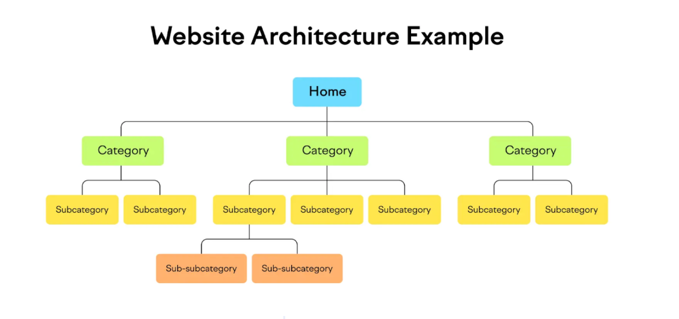
- Use dropdown menus to organize services or offers. If you’ve added new packages, pricing tiers, or solutions, use expandable sections to avoid clutter while keeping everything discoverable like what this home improvement service did with their offers.
Sign 9: Your Analytics Tell A Story You’re Afraid to Read
Analytics don’t lie. When multiple key metrics are trending in the wrong direction, it’s rarely a one-off issue, it’s a pattern. If your bounce rate is high, engagement is low, and conversions are nearly nonexistent, your website isn’t just underperforming, it’s actively losing you money.
If you’ve tried small fixes (copy tweaks, button colors, headline swaps) and nothing moves the needle, the problem is structural.
What To Look Out For:
- Bounce rate over 60%, especially on landing, product, or pricing pages
- Average time on site under 1 minute, indicating users aren’t engaging or exploring
- Conversion rate below 1% on core lead-gen or sales pages—even with qualified traffic
Benchmark To Aim For:
A healthy site should maintain a bounce rate under 50%, average session duration of 1.5–3 minutes, and a conversion rate of 2–5%, depending on industry and traffic quality. If you’re far below these benchmarks across the board, design and UX are likely to blame.
What You Need To Do:
- Use heatmaps and session recordings to find where users hesitate, abandon, or rage-click. Pay close attention to above-the-fold content and form interactions.
- Build a basic conversion funnel in GA4. Map where users drop off between landing and conversion. If there's friction at multiple stages, it's a system-wide issue.
- Work with a design consultant to redesign with a conversion-first approach. Rework structure, simplify choices, and make CTAs prominent. Align every section to a single, clear goal.
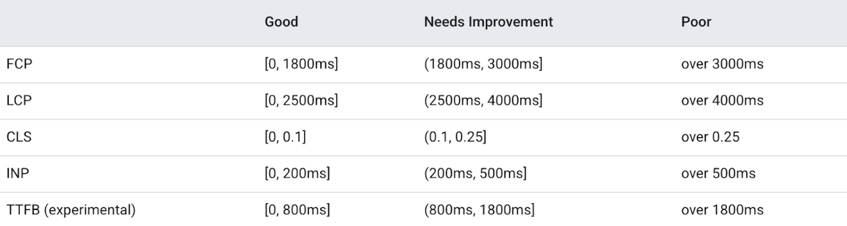
Key Website KPIs & Benchmark Summary
Here’s a quick rundown of the KPIs we discussed earlier in an easy to glance format:
Conclusion
As you apply what you’ve learned, don’t just ask what needs to be fixed, ask what kind of experience your website should create, and whether it’s even close to delivering that.
If you’re ready to explore what a better version of your website could actually do for your business, Olive Street Design helps brands move from outdated to aligned without the overwhelm.
Take the first step here.
Author Bio:
Christian Cabaluna is an SEO content writer with 5+ years of first-hand experience. When he isn't writing in his favorite coffee shop, Christian enjoys reading (especially about psychology and neuroscience), cooking, watching documentaries, camping in the mountains, and catching beautiful sunsets.